A 79 m2 Colorful Family Apartment in Moscow: Photos, Videos, and Estimate of the Completed Interior

We completed this bright and functional interior for a young and active family with a school-going son in the new contemporary residential complex “Richard” in Moscow. The clients were keen on having colors, prints, and patterns, and we fulfilled their desires. First, we designed a comfortable living space by enlarging the bathroom and allocating a dressing room in the master bedroom. Then we filled the space with bright colorful blocks. After that, we completed the interior: and controlled the delivery and work so that the clients did not have to worry about it.
At the design stage, we prepared an estimate and fixed the cost of implementation. This helped our customers know the exact cost of the interior before the work began. During the renovation process, the cost did not change.
We designed and manufactured cabinet furniture specifically for this apartment, taking into account the tasks of future residents.
| Size |
79 m2 |
| Type |
A two-bedroom apartment |
| Years |
2023–2024 |
| Features |
Load-bearing wall between the open plan room and the corridor, a niche in the kitchen area, a narrow and elongated master bedroom |

Low opening in load-bearing wall
Niche in the kitchen area
Narrow and elongated master bedroom

We allocated a dressing room in the master bedroom
We allocated a dressing room in the master bedroom
We visually aligned the wall using kitchen column cabinets
We added a wardrobe to the hallway
We enjoyed working on an unusual task – to fill in the interior with color. White is at the core of finishing whilst each room and even bathrooms have its own color and texture combinations. While choosing the colors of furniture, finishing, and décor, we used the basic ones – blue, red, and green, with adding their darker tints. We made spaces more architectural due to straight lines and volumes.
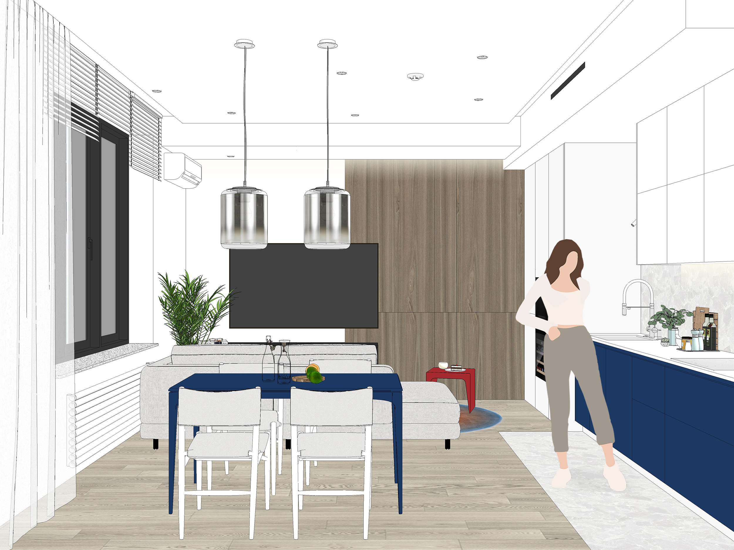
The kitchen is composed of three blocks: dark blue lower modules that appear elevated due to its white base; upper wall cabinets that are divided into squares and rectangles; and monolithic column cabinets with built-in appliances.
The ceiling adds geometry to the space: we made it multilevel. An air supply ventilation duct is behind the volume above the TV. An air supply grille and an air duct leading to the children's room and the parents' bedroom are behind the volume above the kitchen. We didn’t want to level down the entire ceiling because it would have affected the spatial perception therefore we allocated another volume of the ceiling in the center of the room and randomly placed lamps on it.
Using the example of the junction between two different surfaces, we highlighted our careful approach to each element of the interior design in the project.
The developer made a niche in the kitchen area, and we leveraged it in the best way possible. We installed an air handling unit and a noise suppressor in it and also soundproofed all the equipment to prevent noise from spreading through the air ducts and being heard in the room. Access to the air handling unit is through the hatch in the rear wall of the central cabinet. This solution allowed us to level the room’s geometry and not lose any usable space.
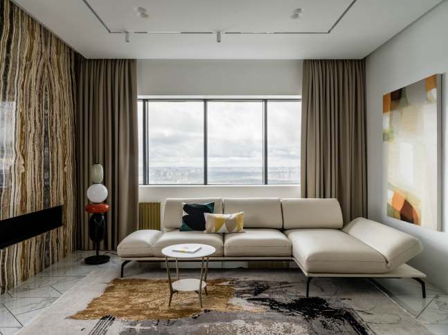
Another block in this room is wall panels finished with ash veneer that create a visual separation between the kitchen and the recreation area. We furnished the living room area with simple-shaped furniture: a sleek hanging TV cabinet and a bright red coffee table.
We opted for a blue table with laconic base for the dining area. The table can be easily extended to comfortably accommodate all the guests. We found an unusual textured solution for the wall behind the table: these are relief gypsum panels which with their randomness add lightness to the interior. We hung glass-shaded lamps above the table. When the lamps are turned off, they reflect the surrounding area, and when turned on, they emit a soft glow.
Working with the entrance to the open-plan room became a challenge for us. The clients were upset that this opening was in a load-bearing wall, and it was not possible to remove the upper part and bring it to the ceiling. We came up with an unusual solution: we mounted a cornice just under the ceiling, on which we hung a bright blue curtain. This not only draws the space upwards but also acts as a divider between the kitchen-living room and the rest of the apartment if needed.
After our redevelopment, there is a corridor that leads to the bedrooms and guest bathroom. To prevent the interior from being divided by the dark zone of the corridor and to ensure that there is daylight, we installed a glass panel door in the children's room. The corrugation ensures that the privacy of the clients' son is preserved, as it makes it impossible to see what he is doing in his room.
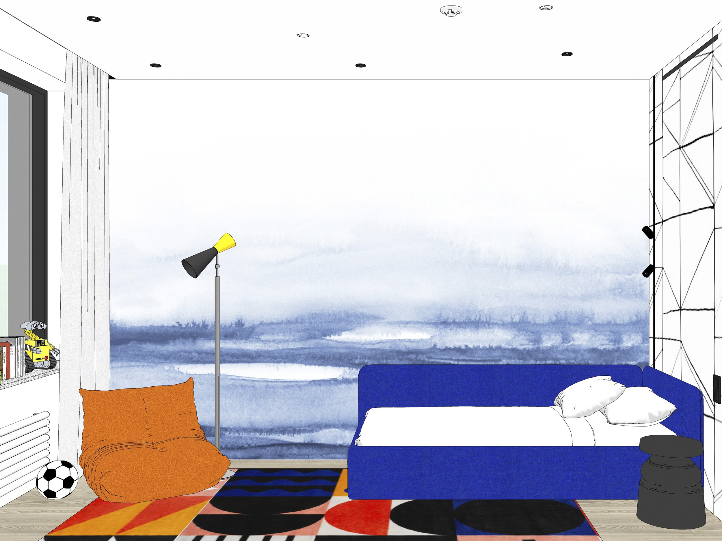
We decorated the walls in the kid’s room using two types of wallpaper. One is with a watercolor gradient, and the other is with lines that look hand-drawn. We made sure to select models that came in large sheets so that we could apply them without any visible seams.
We made the window sill from quartz stone that contains small black inclusions.
We designed and produced a full-height closet for the kid's clothes and toys that blends nicely into the interior thanks to its small black handles.
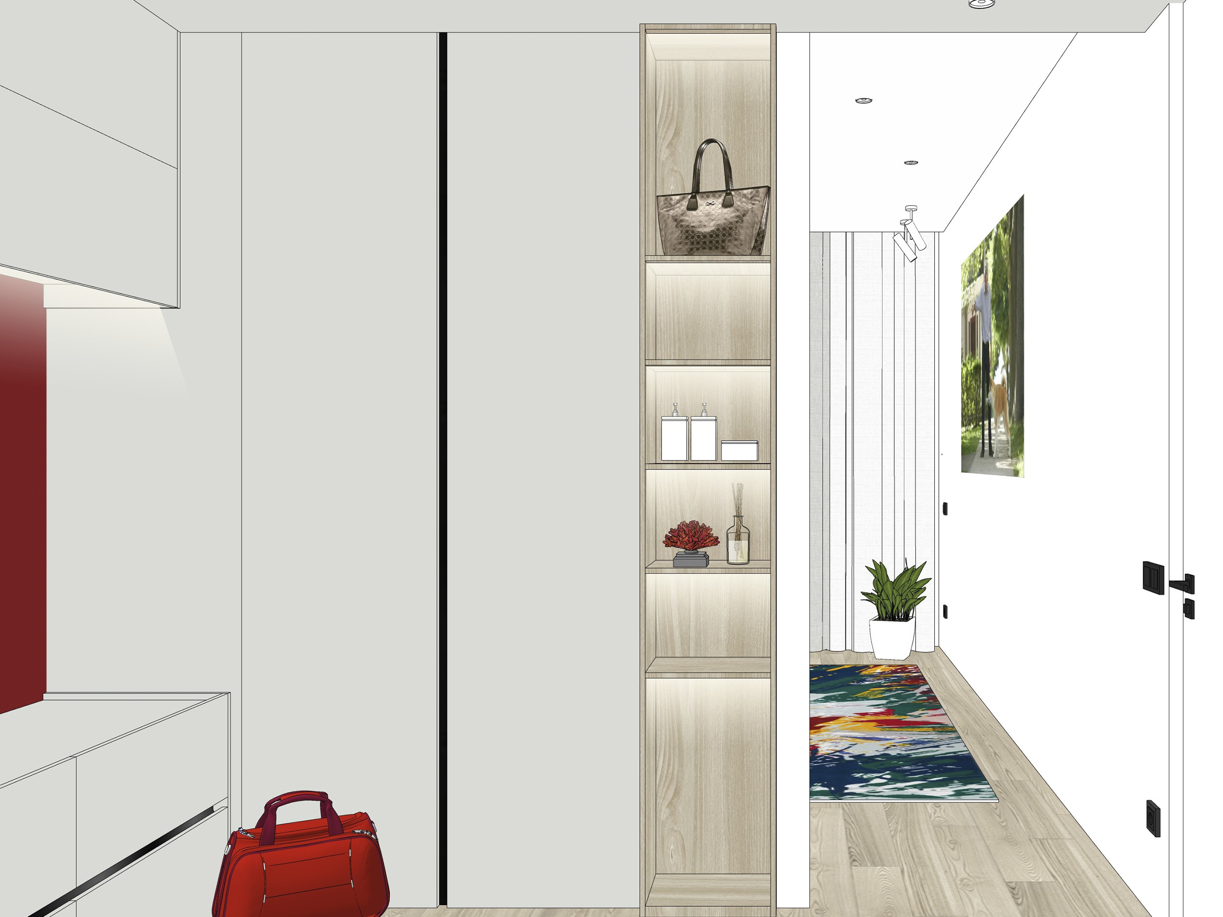
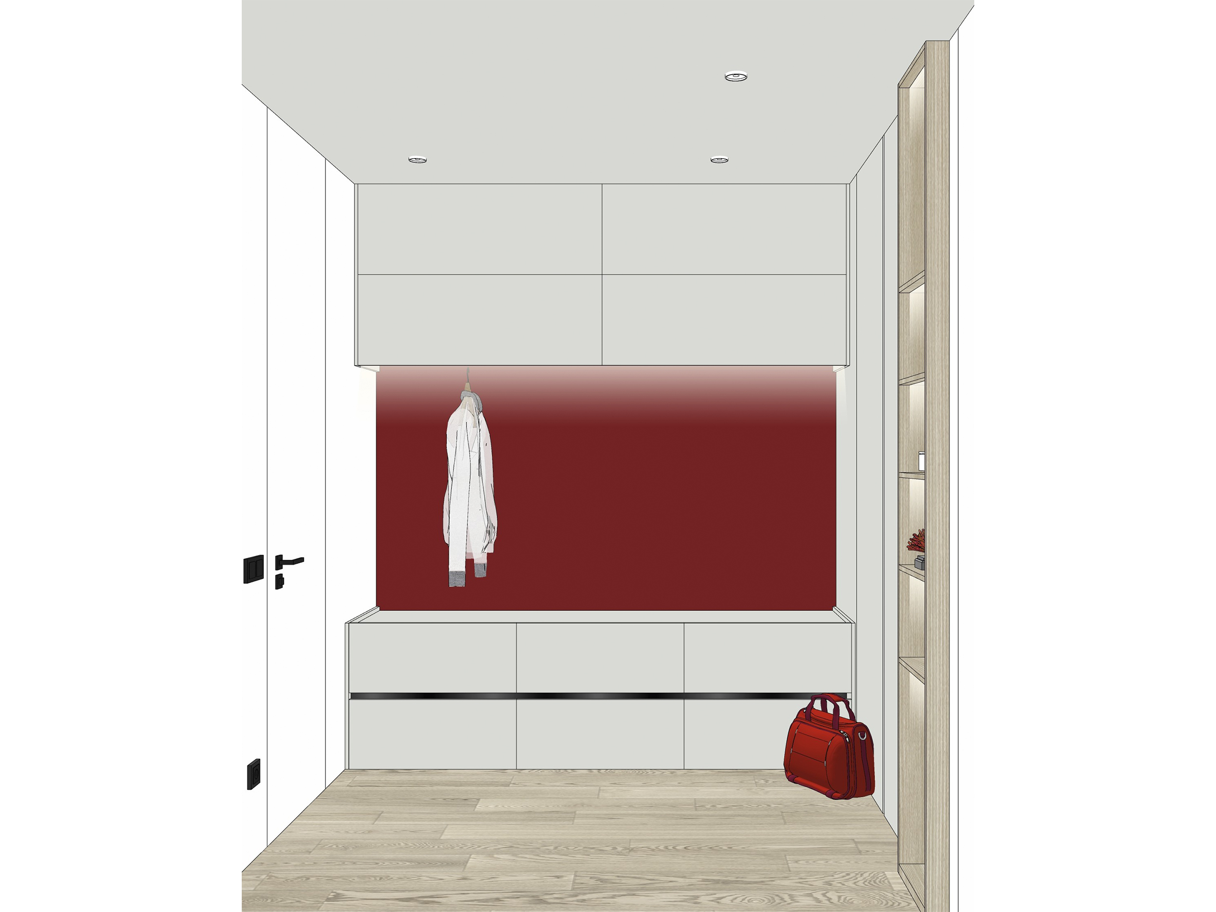
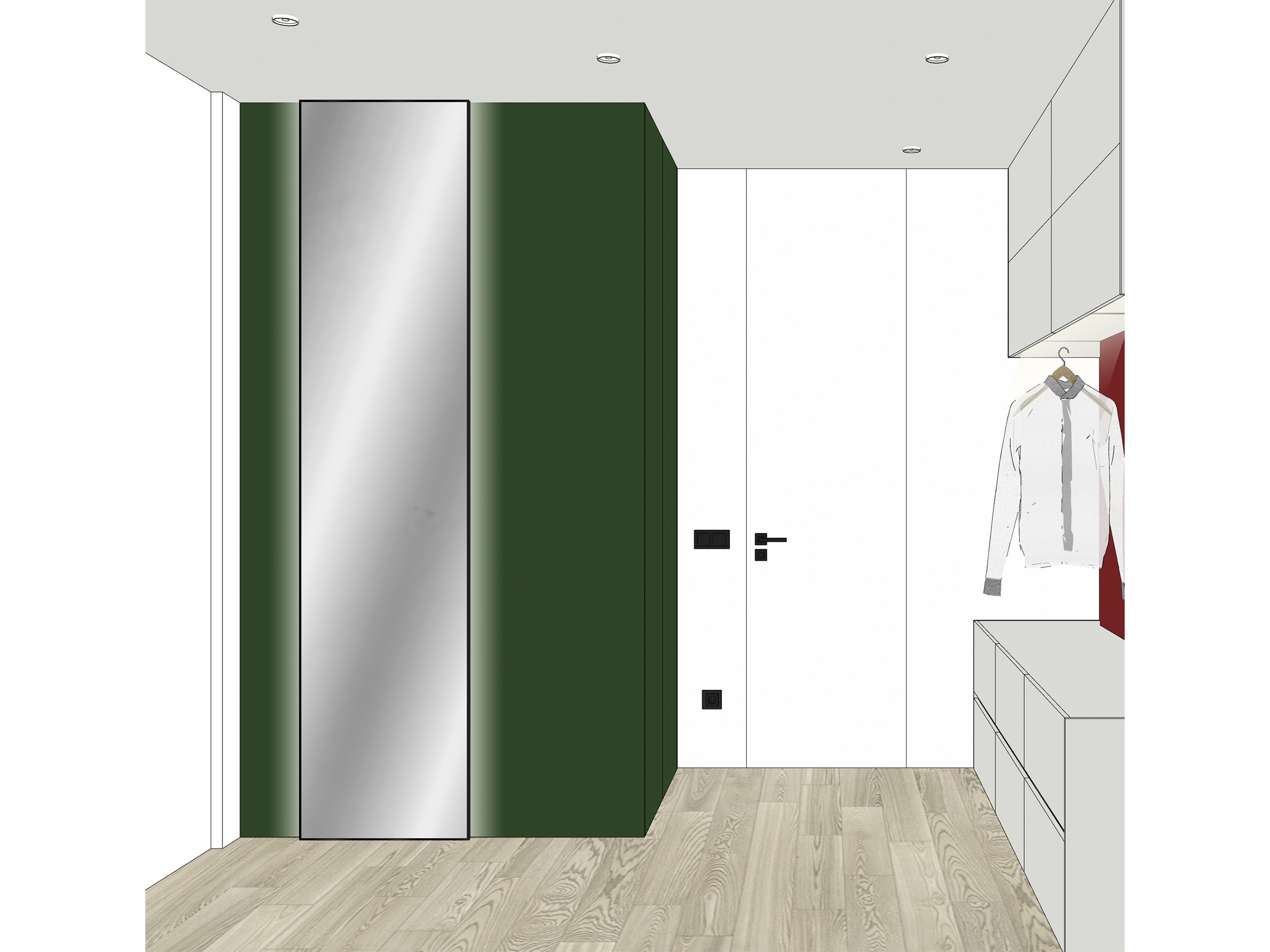
We added a dressing room in the elongated master bedroom which leads to the bathroom. The dressing room includes a small rack with built-in lighting for bags, cabinets with shelves, drawers, open rails, and a ceiling-height mirror.
We also made this dressing room “in blocks”: beige volumes were combined with green and burgundy ones. The green block is a utility closet; where items like an ironing board, iron, and other household items can be stored. Additionally, we have included sockets inside the cabinet for added convenience.
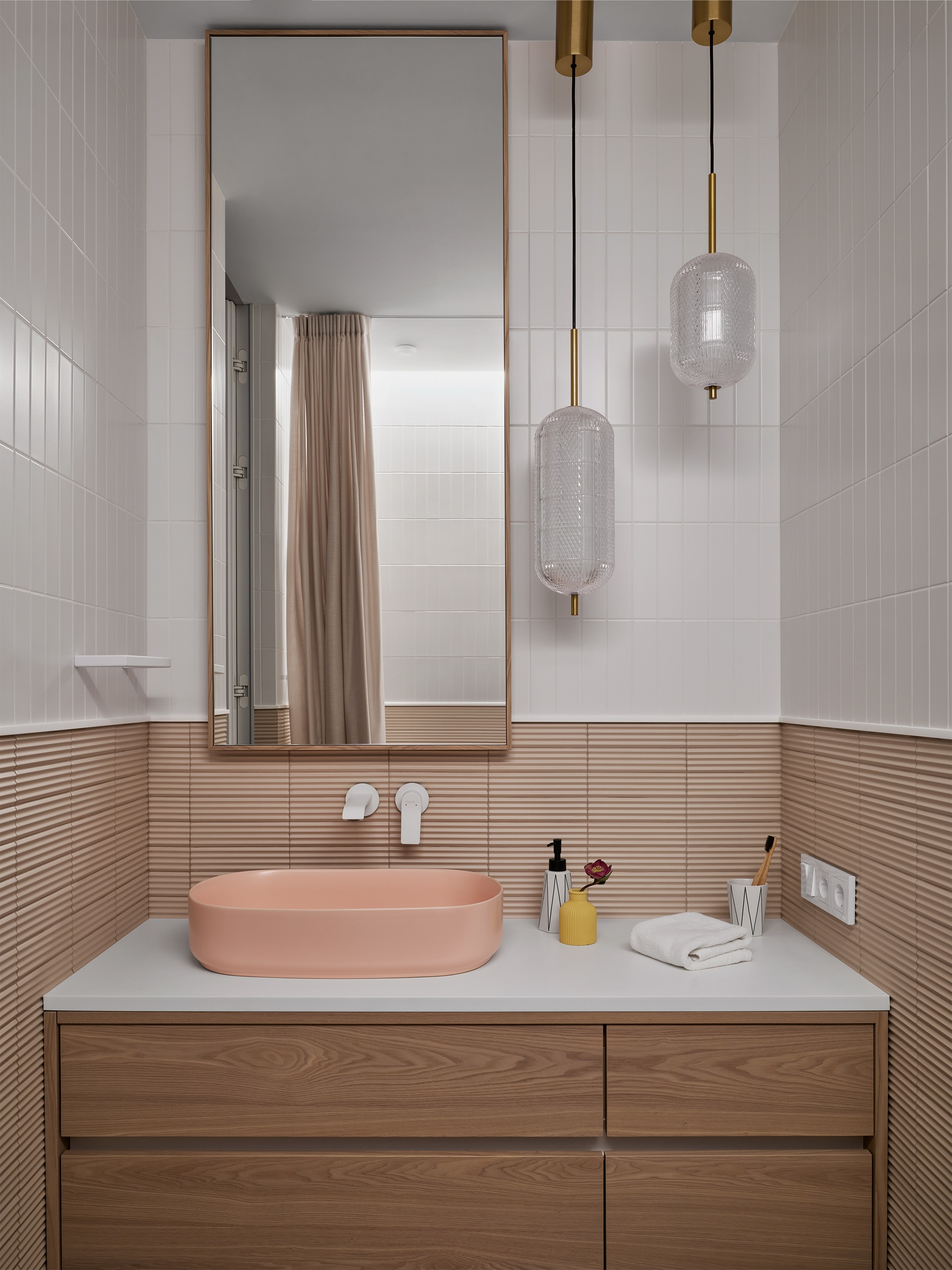
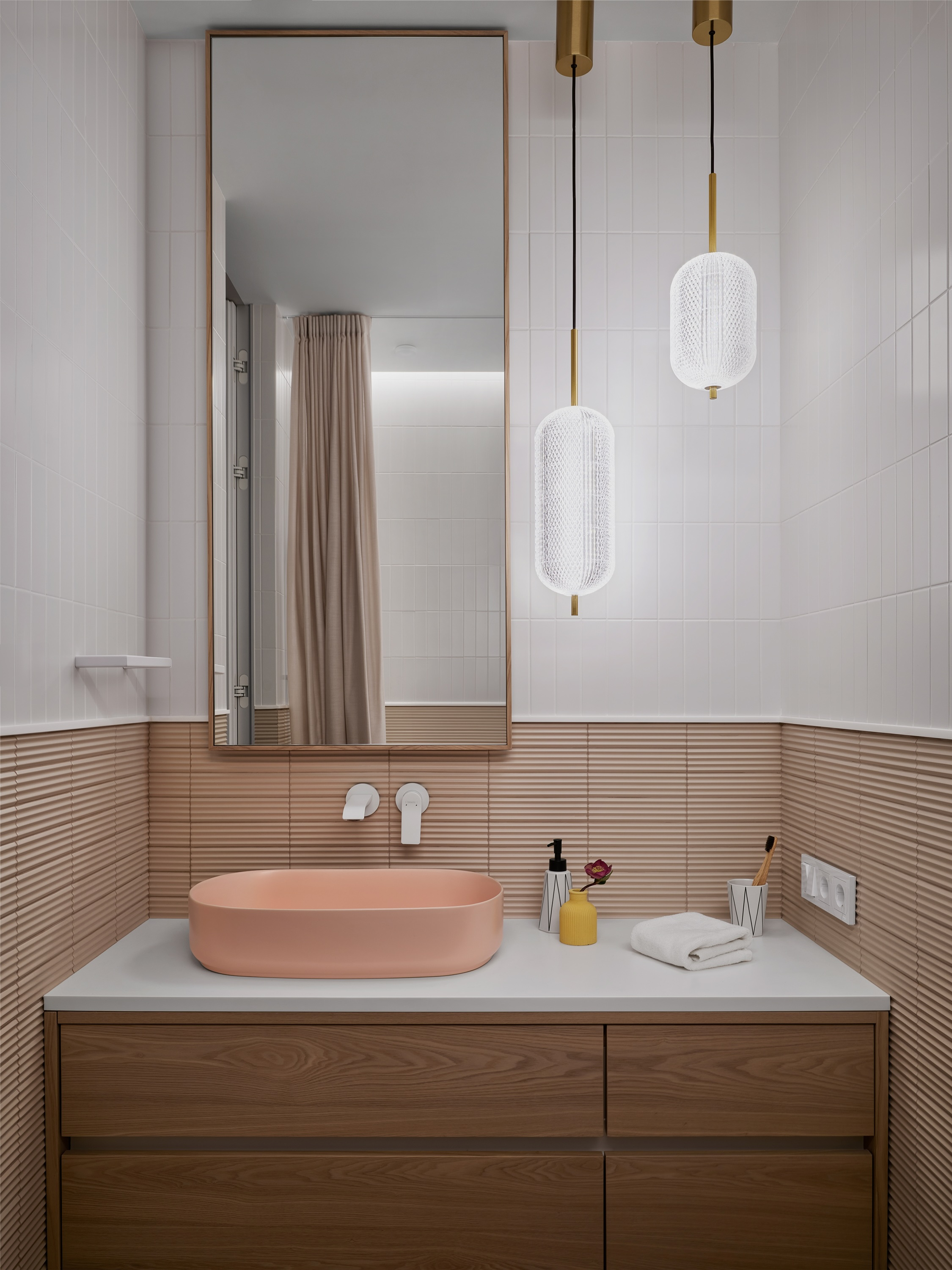
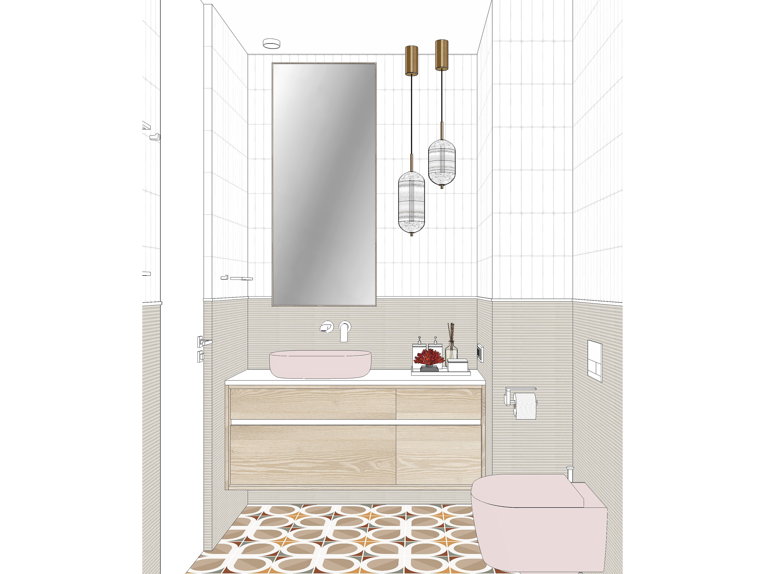
We opted for salmon-colored sanitary and applied two types of small tiles – smooth white and texture matte ones for the master bathroom.
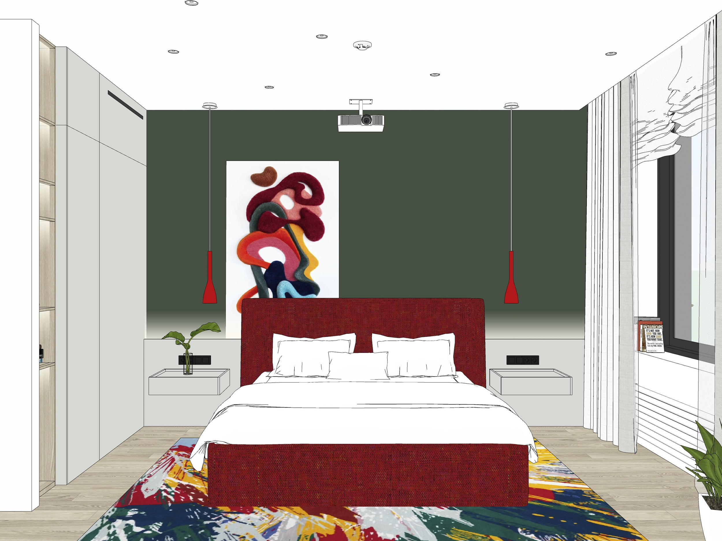
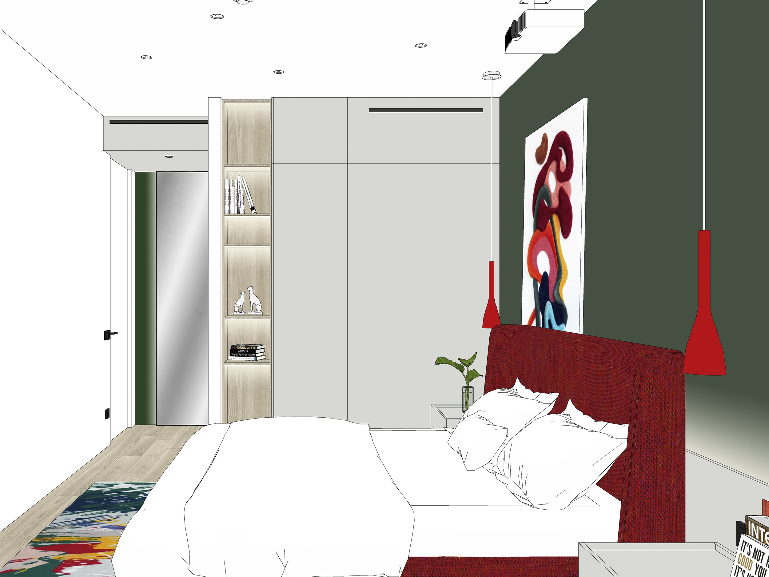
In the bedroom, we combined contrasting colors even more boldly: we placed a bed with a burgundy headboard against the background of a spruce wall.
Red frosted glass lamps were hung on the sides of the bed; when they are turned on, the light fills the entire lampshade with a soft gradient.
The clients did not want a TV in the bedroom, so we hung a projector above the bed. It broadcasts the image onto a flat white wall opposite.
On the bedroom side, the closet in the dressing room is functional. The left part of the closet is a shelving unit with lighting that can be turned on by waving a hand. To the right, there is a module for equipment that can be connected to a projector or a TV set-top box. We have also installed an air intake grille on the mezzanine part of the cabinet. Purified air is supplied through a grille located above the entrance to the bedroom.
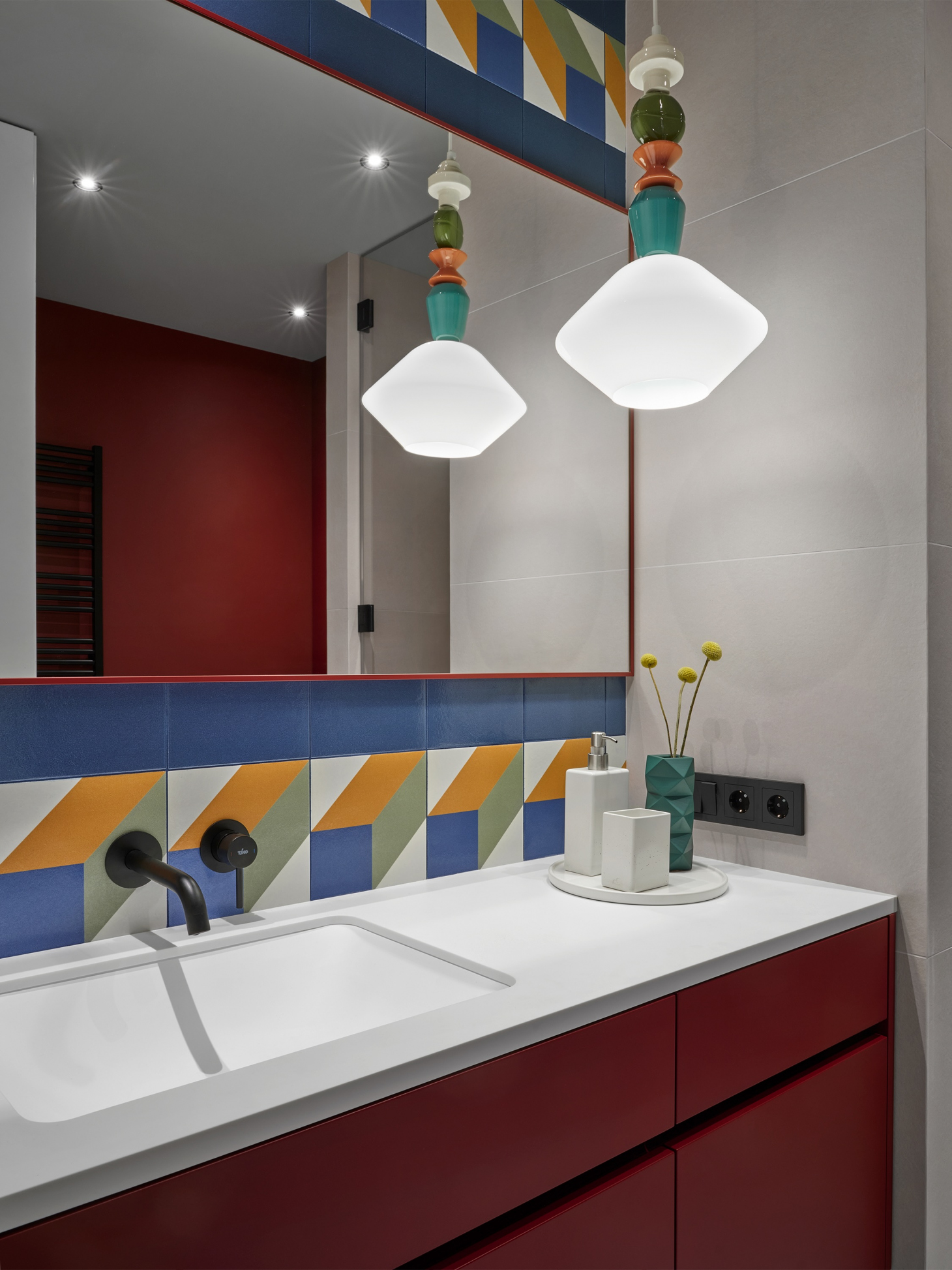
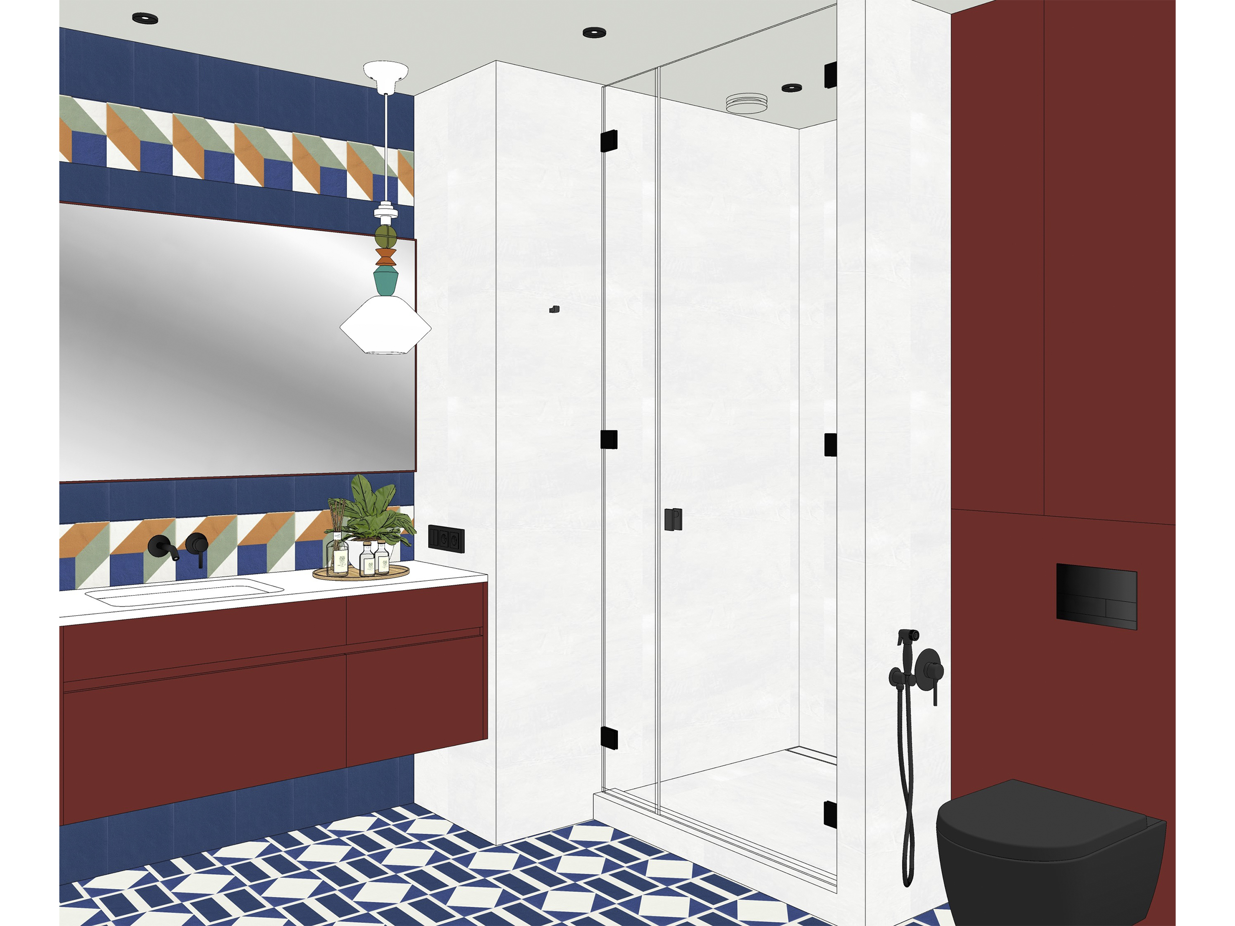
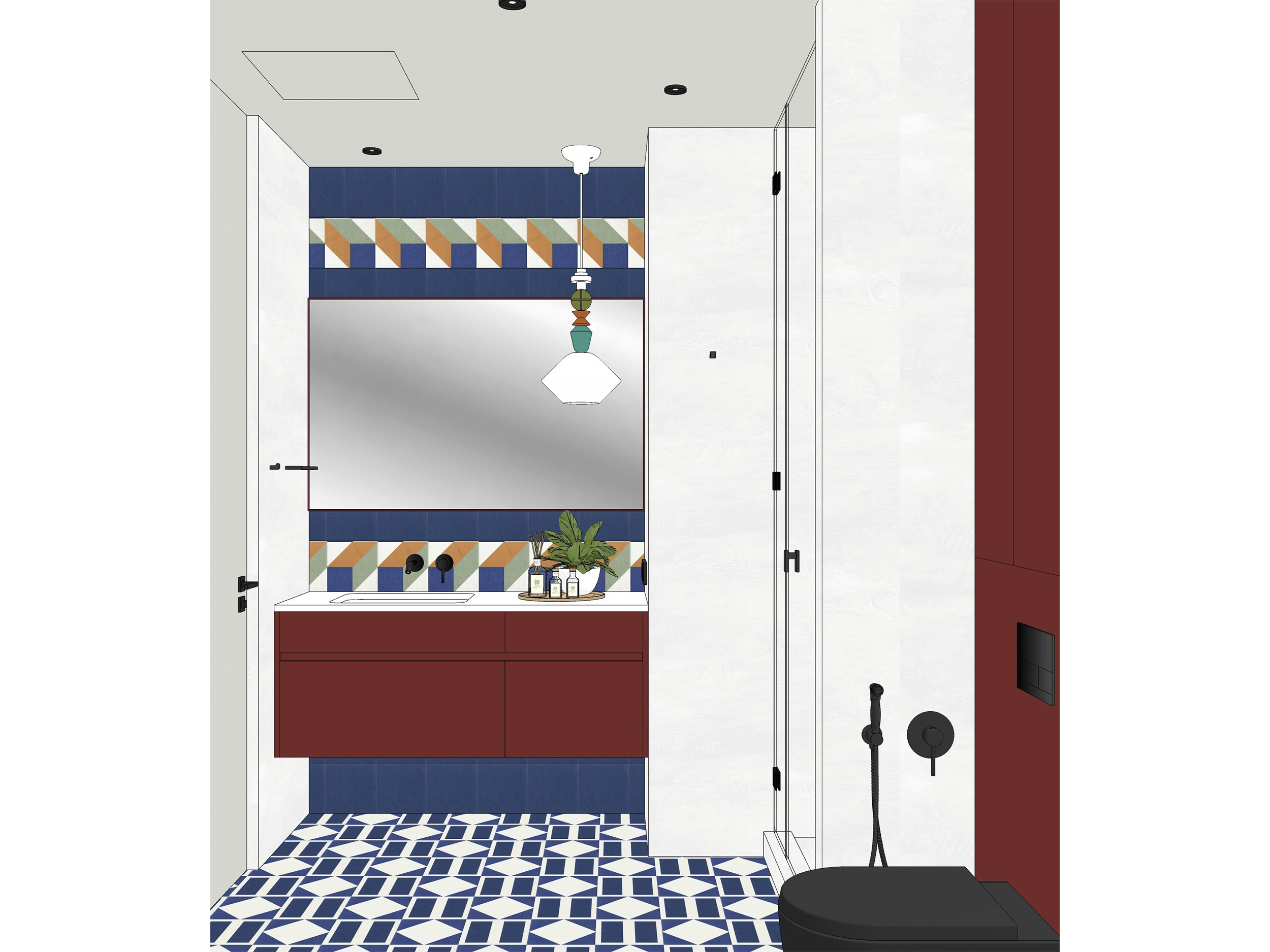
We selected the most daring combinations for the guest bathroom. Here we use multi-colored handmade tiles, rich burgundy furniture, and the same shade of paint for the walls.
We built-in the sink, enclosed the wide mirror in a thin burgundy frame, and chose a funny lamp that supported the play of the pattern of the tiles.
We installed a column cabinet for the washing machine and dryer up to the ceiling. It has a grille on the side for airflow and an exhaust ventilation diffuser at the top.
We showed the arrangement of the cabinet for the washing machine and dryer in this video.
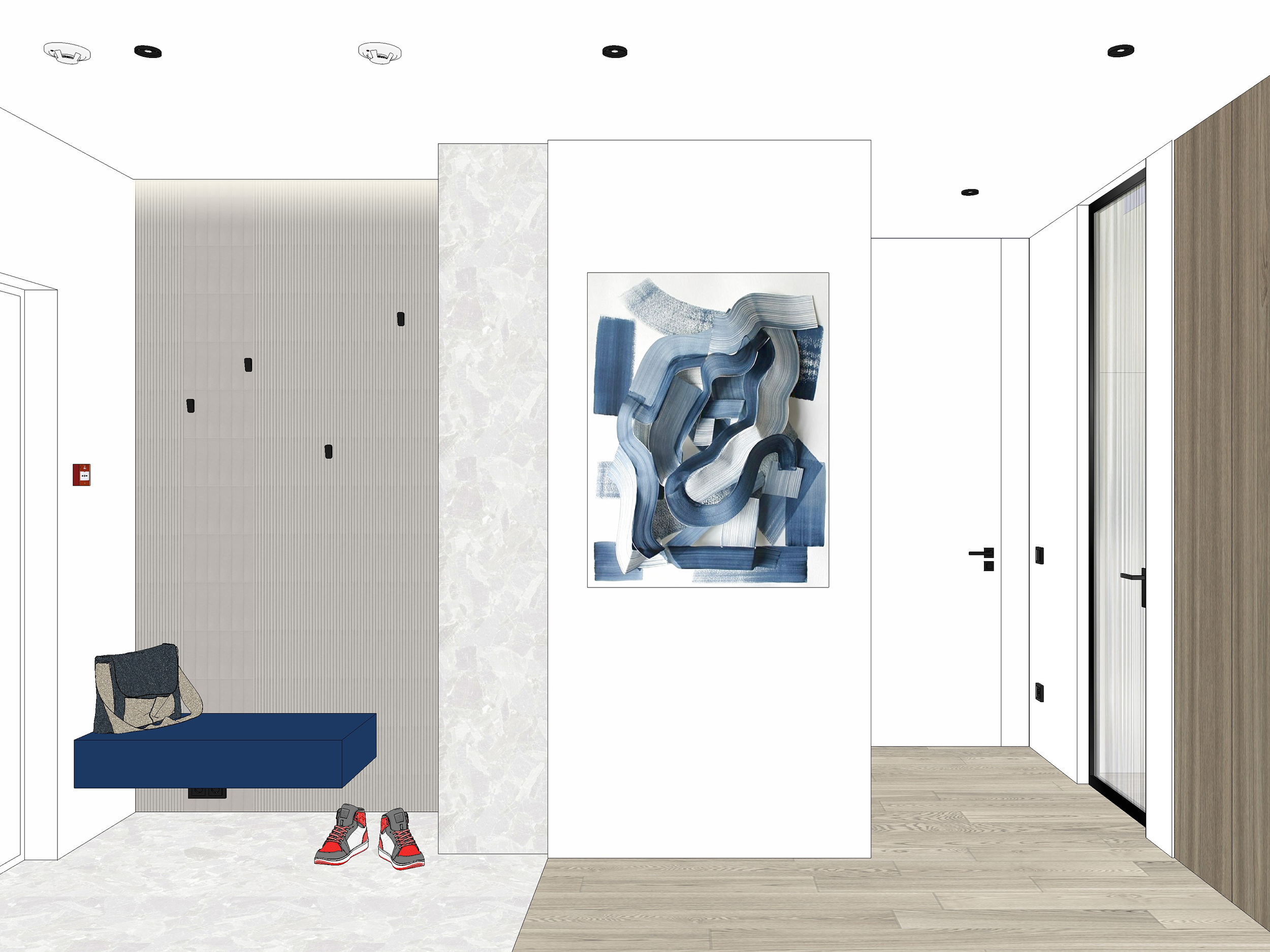
We installed a suspended console in the hallway, which matches the color of the furniture in the kitchen. The relief tiles in the hallway have hooks for hanging outerwear, which were originally intended for towels in the bathroom, but they fit perfectly into the design of our hallway. On the opposite side of the front door, we placed a floor-to-ceiling mirror. We moved the wardrobe for outerwear further down the corridor, making use of some space from the kid's room.
We explained the layout of the hallway in the video.
?autoplay="
title="YouTube video player" frameborder="0"
allow="accelerometer; autoplay; clipboard-write; encrypted-media; gyroscope; picture-in-picture"
allowfullscreen>
You can come to visit this interior with us and see it from the clients’ perspective. They were not immersed in the processes, did not control the construction, and saw the apartment only in the finale exactly as we shot it. In the video, we talked in detail about all our planning and interior solutions. We published this video on YouTube as well.
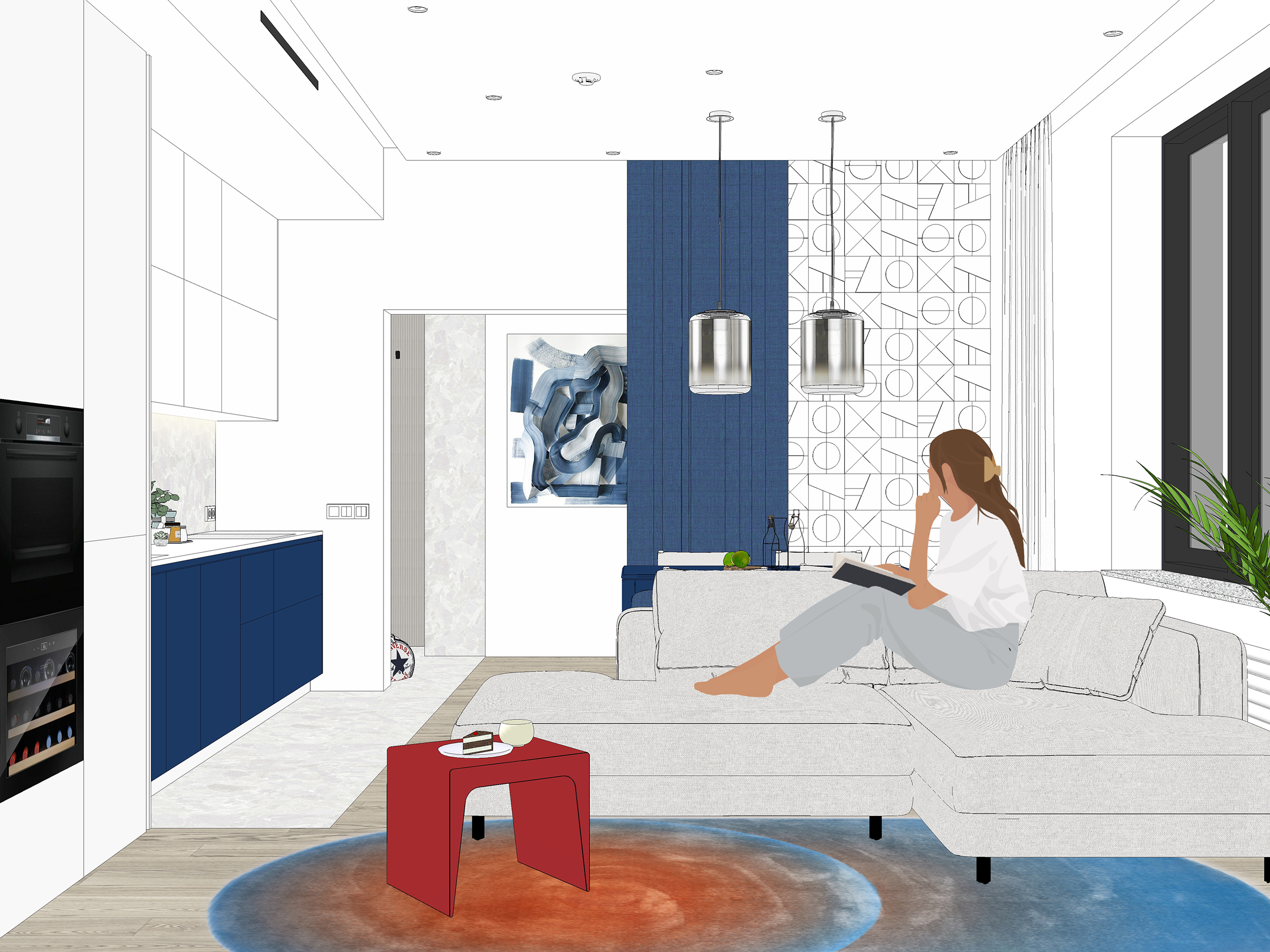
This is how we presented the interior at the design stage: all objects and materials were selected. Careful attention to detail allowed us to complete an interior that fully corresponds to the sketches.


